Nov 16, 2014

Colorful Rotterdam - week 4 - Make Art That Sells

The fourth week of part B of the inspiring Make Art That Sells course was about the editorial market. Illustrations for magazines, books and newspapers. Our assignment was to make a map of your own city or from a city that you love. I live in Rotterdam and I love my city, so I made this map of colorful Rotterdam:

 If you like, you can see it in a bigger size for more details here


First we did some handlettering of the name of your chosen town. I started in black and white. Then I started to play with color and made these letters. This was the big inspiration for my map:


Rotterdam has beautiful architecture, but what I love the most of my city is that it's multicultural. So many colors and a variety of cultures. I wanted to show the richness of all these colors in my map. I took that as a theme. I love to draw people,  that's why there are so many on my map:


I place some of them here seperately so you can have a closer look:


We also have a nice zoo, named 'Blijdorp' with a beautiful garden. Some years ago I went there very often and  took many many photographs of all the animals. I have a nice archive.


Because of the color theme I also included a scene of the Summer Carnaval. It's a special event in Summer: a tropical streetparade with lots of colors and happy people:


I also tried to draw different nationalities, which is new to me. Also a  nice challenge:


If you look well, you can also see a selfportrait in the map: Me on my bike.
I always do everything by bike:


 Another lady walking with her two dogs:


I really loved this assignment. It was a lot of work, but such a great challenge to draw some well known Rotterdam buildings and all those different people. The editorial market  seems an attractive market to me!
Now we only have one week left. The party paper week. It's a pity it goes that quickly. I love this course. So inspiring and challenging!! Will be continued....!


Nov 9, 2014

As times go by - week 3 - Make Art That Sells

This was already the third week of part B of the inspiring Make Art That Sells course. We learned about the scrapbooking market. This is again a totally new market for me. I'm not sure if I made something appropriate for scrapbooking, but the challenge was also to create something you like yourself.

And I am not a scrapbook maker / user. Scrapbook people are making memory / photo albums using all kind of  'icons',  to brighten up their pages. The assignment  was to create a vintage correspondence themed scrapbook collection, which incorporates clocks.


As usual on Monday we first got  a theme to draw, which were vintage clocks this week. So I googled and drew some of the gathered material.


On Wednesday we received the assignment. To create a scrapbook collection, not only using vintage clocks, but it also had to be a correspondence themed collection... This was a bit confusing at first. What have clocks to do with correspondence?

I first wrote down some associations with time. Such as: quality time, creating time, timeless,  no time, anytime, as times go by, summertime, time flies, tea-time, coffee-time, bed-time, spare time, slow down, time for change, take your time, present time...

I didn't think a lot about it, but began to draw. I started with this meditation girl: 


Meditation has everything to do with time and timelessness. My first association with quality time.

I also began to draw some icons with the correspondence theme. As I was busy drawing and putting the icons in one file, the two themes surprisingly came together very well.


I show you some of my drawings / icons a bit bigger, so you can see them better.
I loved these envelope parade I made:


And ofcourse I also drew some  pigeon carriers. Nice to see how he is also associated with time. No quick e-mails, but a pigeon who has to fly all the way to bring the post, which takes time...


I may be new to this Market, but I loved the assignment! It was quite a challenge to fit all the icons into a nice composition. I'm happy with the result. I posted on Flickr a bigger version of the assignment.What you think of it?

Next week we gonna look to the editorial market. Also interesting. Will be continued!


Nov 7, 2014

Announcement Opening WinterWinkel in Amsterdam

Today La Grande Opening of the WinterWinkel in Amsterdam. Just as last year the ladies of the Ka-Ching Collectief  organised a pop-up Shop in the center of Amsterdam. I'm happy Red Cheeks Factory is selected to join with 25 other participants!

Here's a photo I took of the building when I brought my products last Friday:


It's in a nice building (a former pleausure house ;-)) with 3 levels. Enouph room for a shop, an office and a workshop space. The opening is from 16.00 till 18.00 hour at the Oudezijdse Achterburgwal 121. You are all invited!


Above a photo from last year's WinterWinkel with my prints.

The shop will be open till the 24th of December.

Nov 5, 2014

Exhibition Marlene Dumas

Last Friday I had to bring my work to the temporary pop-up store 'de WinterWinkel' in Amsterdam (where I will blog about later this week). After that I went with my brother to the Marlene Dumas exhibition 'the image as burden' in the Stedelijk Museum.


It was impressive! I've seen her work more often, but never so many works together in one exhibition. Most intriguing for me are her faces. So many different expressions and emotions. Good to also see some insights in her working process.


Every hall has a different theme. The painting below was in hall with the theme: sorrow.
This was one of my favorite paintings:


If you like  you can watch this video which leads you through the exhibition, including a little interview with the artist. It gives a good impression. (english subtitled)

The exhibition will be there till the 4th of January.

Nov 2, 2014

Cowbear Party - week 2 - Make Art That Sells

This was the second week in part B of the Make Art That Sells course. It was all about the baby apparel market.Theme: Cowboys and Cowgirls, yeeha!

We were asked to develop a pattern with this theme appropriate for the baby apparel market. It's a totally new market for me, but I love to make patterns and I love to draw for kids. So it was a fun week for me!


I first did some research on the theme and gathered a lot of cowboy and their attributes and environments pictures. I had fun drawing them. It's such a good way to come into the mood of the assignment:


Ofcourse I also drew some cowboy faces with cowboy hats:


And lots of horses, here are a few:


I decided not to take cowgirls or cowboys for the assignment, but cowbears instead.
The whole week I had the Susanna song in my head, only the first sentence:

when I came from Alabama,
with a banjo on my knee...

That's what inspired me to make this Banjo Bear:


We were also asked to make lots of icons and variations in your presentation. I think this was the most challenging part for me. Also to make some patterns, called coordinates that fit with the main pattern. So it can be used in combination with each other to make clothes for kids.

Beneath you see the final result. If you wanna see it in a bigger size, click here


Next week we gonna look at the scrapbooking market. Also new to me.
I wonder what that will bring :-) Will be continued...


Oct 26, 2014

Make Art That Sells - Happy Holidays

Remember I joined the Make Art That Sells course with Lilla Rogers last spring? I'm now taking part B. Another five weeks cover five different markets: paper goods, baby apparel, scrapbooking, editorial and party paper

I just had my first week: paper goods. Here's the result.of the first assignment: a winter holidays postcard featuring penguins:


First we got the mini assignment to loosen up, trying different techniques and get to know the subject. So I was diving into the world of the penguins. I love these animals, their clumsiness is funny. I never saw a baby penguin before, they are  so cute. I would love to see them in real.


Baby penguins where not the only ones I drew. I also made these red cheeks variations:


Below more experiments, now I added some more color:


I also discovered this new technique. I drew lines with a sharpie, scanned them in, reversed the black lines into white ones and added the colors with some monoprint brushes I created. I like the effect, I think I'm gonna try this technique more often:


After all these penguin drawings we had to create a winter holiday postcard. The assignment was open. Only thing given was the subject and the size. It needed to be a portrait format. Funny I had several ideas which would fit better in a landscape format...

My challenge was to add a lot of 'icons'. To make a kind of winter holidays collection and still try to keep it organized. Would you buy a card like this?


Next week we gonna take a look at the baby apparel market. I'm already curious!
Will be continued!

Oct 18, 2014

Exhibition Mark Rothko

Today I went with my brother to the exhibition of Mark Rothko.(1903-1970)
in Gemeentemuseum The Hague. It was a nice experience!


We went early because we had heard the exhibition attracted a lot of visitors. But Saturday morning at 10 o'clock you have the chance to see his paintings without lots of people walking in front of them.


Here's a visitor in black watching one of Rothko's black paintings:


The exhibition gives a good overview from his earlier work, the development to the abstraction and the inmense colored squares, which became more and more dark at the end of his life.


Here's one of his brighter paintings, which I love:


It was a bit difficult to make photographs, because the museum rooms were not so light. That's how Rothko wanted to show his work. On eye level on the walls in a dimmed light, so the visitor has the chance to absorb his work more.


And as always, with such a huge exhibition, they make up some commercial items. I'm always curious where they come up with. Besides postcards, they also sold Rothko bon bons :-) I wonder what Mark Rothko would have thought of that...


You have the chance to vist this inspiring exhibition till the first of March.
So if you are in the neigbourhood, grab your chance!


Oct 17, 2014

My 'umbrella mix' in the Spoonflower top 10!

Remember my umbrella mix? I asked for your votes and it did help!
My design is number 4 in this weeks Spoonflower contest.
See the whole top 10 here


I'm extra happy, because there were a lot of entrees this time.
My umbrella mix  got 431 votes! Thank you all very much!!
I really appreciate your support :-))

Oct 15, 2014

Affirmation Angela

Let me introduce you to: Affirmation Angela, supporter of positive thinking. 


Positive thinking

I'm not always good in positive thinking. I know it helps to do so, but sometimes negative thoughts take the overhand. Some time ago I've read the book positivity from Barbara Fredrickson. Inspiring!

It really helps to transform negative thoughts into positive ones. Or to get inspired by a nice and stimulating sentence as: 'make it happen!' It makes me happy ;-)


New product

Because I know I'm certainly not the only one busy with this subject, I thought it would be nice, to develop a product to support people on their journey. And what could be more supportive than  a kind of 'guardian' angel. So I developed this little angel Affirmation Angela. 

You can cut her out, fold her following the instructions. Put her on your desk, on your kitchen table, in your bookshelf or wherever you want. She can hold an affirmation card on her lap. To inspire you or to remind you to be positive.


Affirmation cards

The package includes 8 cards, 12 different affirmations.
(4 on the backside, also 4 blanc cards to fill in your own positive texts)


If you like some positive support or you know someone who can use it,
Affirmation Angela is available here

Oct 10, 2014

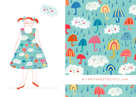
umbrella mix

It's voting time again! I can use your help and would be very happy with it! (again ;-))
Here's my entree for these weeks spoonflower contest. Theme: umbrella.
You can vote for it by clicking this link and scroll to find my umbrella mix.


I've tried to make a cheerfull design in contrast with those grey rainy days...
Ofcourse I also made an illustration to show the pattern on a dress:


Here you can see the umbrella mix on a cushion:


Because I liked the umbrella theme very much I made some more patterns on this theme.
'Cats and umbrellas' is one of them:


Here you can see the cats and their yellow umbrellas and boots on a cushion:


And another one: it's raining umbrellas. This was the last one I made.
Also a cheerful design:


The 'it's raining umbrellas' pattern on a cushion:


Because you can only add one design per week to the spoonflower competition, I had to choose. I didn't find that easy, but I chose for the umbrella mix (see the first image of this post). I'm curious: which one do you like the most?


Oct 9, 2014

galerie XS

Some of my works are part of a special exhibition in galerie XS. It is the smallest galerie of Delft (close to Rotterdam in the Netherlands). It 's the first exhibition of this tiny gallery with the theme: illustrations.


The organisator of this event is Margo Weijer a creative and enthusiastic artist. She invited me to join this exhibition. She selected some very nice artists, like Karolien van der Stappen and Eveline Ester Thijs. It's an honour to be amongst them.

Coming Saterday the 11th of October there will be the opening at 15.00 hour.


I think it will be quite a happening and I'm looking forward to it :-)

If you are in the neighbourhood, you are very welcome!
You can find Galerie XS in the Voorstraat 16 in Delft.

Oct 7, 2014

quote of the day

 Look at this: Featured today on the Make It In Design blog as quote of the day :-)

Oct 3, 2014

Thank you!!!!

Unfortunately I didn't reach the top 10 in the spoonflower table and chairs contest.

BUT....

I reached the top 20 with my mad tea party pattern! Not bad, huh?


Thanks to your votes! I'm grateful for your support!
Here you can find the winners. Congratulations to them!

Sep 25, 2014

Mad Tea Party Pattern

This week I join the Spoonflower competition again. Subject is tables and chairs.
I wouldn't think of such a theme, but it inspired me to make this 'mad tea party' pattern.
I like it to give them characters, as if they have their own party :-))


mad tea party pattern - Red Cheeks Factory


If you like it, you can vote for it here,  Last time I joined I reached the top 10 with your help. It would be great to reach that goal again! Thank you very much in advance.

Since last week you can order some fabrics and wrapping papers designed by me in
my Spoonflower shop. You are welcome!

Sep 22, 2014

#WordEenWebVedette

Marketing specialists MamaMarketing gonna change their name after 4 years. They have asked people to tweet their favorite quotes and share them on twitter etc. with the hashtag WordEenWebVedette. My most favorite quote at the moment is:


illustratie: Nelleke Verhoeff - Red Cheeks Factory #WordEenWebVedette


I follow them for a while now. They have an inspiring blog (in Dutch) Full with all kind of tips. But I always felt a bit strange about the name, because I am no Mama (Mom). So it was as if it was not for me. But to be honest I can certainly use tips about marketing. It's not my strongest point. So now they gonna change their name into WebVedettes. I like the new name :-)

When I saw their request to share your favorite quote(s) I began to draw:


illustratie: Nelleke Verhoeff - Red Cheeks Factory #WordEenWebVedette


It is a competition, so you can win a prize: A two hours marketing session about your webshop. Well who knows, I followed the advice of my quotes. Hope it works ;-)

Sep 18, 2014

My Parade in the Spoonflower Top 10!
Jippieeeeeee!
My Red Cheeks Factory parade made it to the top 10 of the Spoonflower contest :-)


Thank you all very much for your votes and support. You can find the whole top 10 here